1006 Morton Street
Baltimore, MD 21201
410.576.9131 | RW1haWw=
February 10 2008
House of Sweden in Washington DC
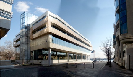
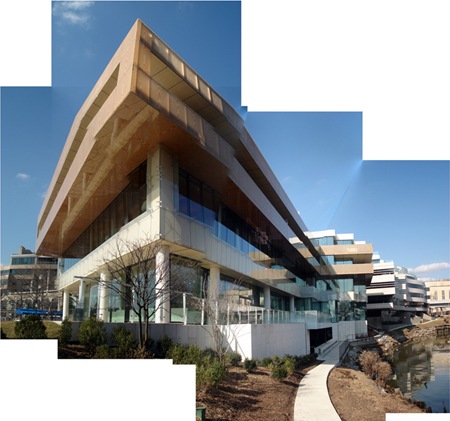
This week I had the good fortune to visit the Swedish Embassy (House of Sweden) in Washington DC. (No, I did not visit the DC IKEA...) What I found was a beautiful piece of modern architecture showing many of the traits people have come to expect from contemporary Scandinavian design. Powerful themes such as water, ice, forests, stone, the darkness of Nordic winter and the lightness of Arctic summer echo through the architectural form and material palette of the building. Combined throughout the interior and into the spatial experience, these primal elements reinforce the architects vision that the visitor is stepping into a cooler Nordic environment filled with glowing light, dark lakes and pristine forest.
House of Sweden architects, Tomas Hansen and Gert Wingardh of Wingardhs Architects, were given a very simple design brief. "Design a building that communicates the message that Swedish government and politics are characterized by transparency and openness." The designers add that "We are proud to say that we have a transparent and open form of government in Sweden, and so we wanted the building to match this transparency by showing what goes on inside. We have tried to create a building that conveys something uniquely northern, like the low setting sun at dusk that creates a very reddish light. We wanted the building to glow with the same light."
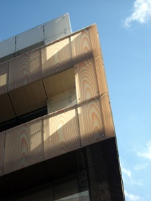
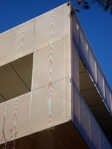
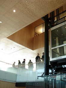
The concept of a Nordic Light is used repeatedly in the embassy. Most dramatically, the architects placed a cantilevering glass rectangle at the third level which is imprinted with computer generated images of wood veneer. (The original intent was to use real wood veneer, but due to the humid climate in Washington the designers were forced to improvise.)
?We decided to go for a computer-generated, exaggerated wooden veneer, which was printed on a film,? says Wingårdh. ?This goes back to the great Swedish tradition of imitating wood and marble in what used to be a rather poor country.?
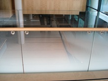
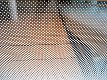
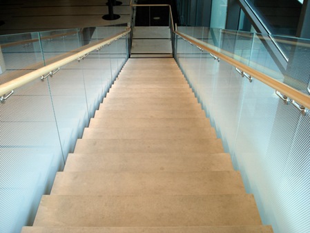
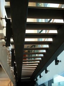
Elsewhere in the building glazed panels are screened with a gradient density dot matrix to create the effect of fog. These panels are used to illicit a sensation of descending through space in areas like the grand staircase to the exhibition halls and the exterior egress stair.
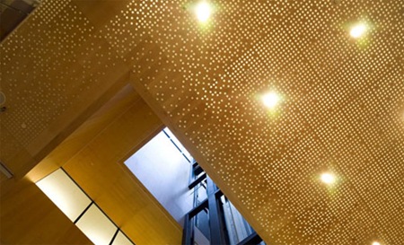
The wood veneer presented on the exterior of the building is again reinforced on the ceilings, walls and detailing of the interior. Lay-in maple veneered ceiling tiles with randomly placed circular holes create a ceiling plane that designer Hansen describes as "cloudlike." Handrails and curtain wall panels (where not just butt-jointed) are light maple wood.
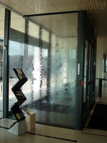
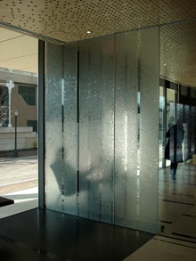
To contrast the warm wood ceilings and floors, the architects also introduced water elements. For instance, water cascades gently down both sides (right and left) of the entry vestibule to mark the passage from exterior to interior. The water is sandwiched between two layers of glass so there is no splashing or spill onto the adjacent surfaces. The effect is quite calming and unexpected. The second water element is located on the basement level under the stair at the exhibition level. It is a dark (slate possibly) shallow pool of water designed to recall the "dark bottomless tarns found deep in the woods of Sweden. Interestingly the pool parallels the Rock Creek flowing just feet away from the building.
Spaces inside the 69,000 sf, five story, building include the main Swedish embassy, several exhibition spaces, a daycare center, and two floors of apartments and offices for use by the Swedish business community. "House of Sweden [is] a highly visible platform for the country and its commerce, culture, science, and diplomacy."
I must also add that it was a pleasure to visit the embassy. It does just what the architects claim in terms of openness and transparency. The feeling was more of being in a well designed museum space than a bureaucratic labyrinth. One quote in particular stands in contrast to most ideas about embassy design (especially US embassy design):
"The House of Sweden's combination of public and official activities and the broad expanses of glass run counter to the prevailing notion that embassies must be fortified bunkers.... few nations can afford to do it... we can"
- Ambassador Gunnar Lund
Related links:
Wingardhs (Architects)
Sources include Sweden.se and the WashingtonPost.
svgallery=SVGallery_HouseSweden
Recent Posts
Reimagining Harborplace to Create Space for Both Private Development and Expanded Public Space » Lawyer's Mall Reconstruction Progress » Confronting the Conventions of Customary Practice » Reconceived Facades: New Roles for Old Buildings » Ivy Bookshop Opens for Business! »
Categories
Yellow Balloon Baltimore » Products + Technology » Industry + Practice » Other » Architecture »
Links
Organizations
- USGBC Baltimore Regional Chapter »
- AIA - American Institute of Architects »
- USGBC »
- The Walters Art Museum »
- Green-e »
- Center for Building Performance and Diagnostics (CMU) »
- Green Globes »
- Prefab Lab (UT) »
- Center for Sustainable Development (UT) »
- Architecture 2030 »
- Bioneers »
- Street Films »
- FreeCycle »
- Chesapeake Bay Foundation »
- Archinect »
- BD Online - The Architects Website »
- National Wildlife Foundation »
- Natural Resources Defense Council »
- Overbrook Foundation »
- Merck Family Foundation »
- Ecology Center »
- New Building Institute »
- Neighborhood Design Center »
- The Leonardo Academy »
- ZigerSnead Architects LLP »
- The Rocky Mountain Institute »
- Urban Habitats »
- ACORE - American Council on Renewable Energy »
- Parks and People Foundation of Baltimore »
- Open Society Institute of Baltimore »
- Natural Capital Institute »
- Passive House US »
- Svanen Miljomark »
- Green Restaurant Association »
- Rocky Mountain Institute »
- Green Exhibits »
- Green Roundtable »
- John Elkington - SustainAbility »
- SustainAbility »
- Building America »
- Endangered Species Program - Fish and Wildlife Service »
- Congress for the New Urbanism »
- Urban Land Institute »
- Cool Roof Rating Council »
- Montgomery County (MD) Public Schools Green Building Program »
- National Institute of Standards and Technology Software »
- Scientific Certification Systems »
- Community Greens »
- CBECS »
- CASE - Center for Architecture Science and Ecology »
Interesting Sites
- The Ecologist »
- Treehugger »
- Grist »
- WIRED »
- Planet Architecture »
- MiljoBloggAktuellt - Environmental News Blog (Swedish »
- Sustainable Design Update »
- Eikongraphia »
- World Architecture News »
- The Cool Hunter »
- Design Center »
- ZEDfactory »
- Architen Landrell Associates Ltd. »
- Environmental Graffiti »
- businessGreen »
- Best Green Blogs Directory »
- Groovy Green »
- EcoGeek »
- Urban Ecology »
- Locus Architecture »
- Urbanite »
- A Daily Dose of Architecture »
- Adaptive Reuse »
- Audacious Ideas »
- Big Green Me »
- NOTCOT »
- Sustainable Baltimore »
- Thoughts on Global Warming »
- Green Maven »
- WorldChanging »
- Go For Change »
- Building Green »
- Home Energy Magazine »
- Home Energy Blog »
- FEMA Map Service- Federal Emergency Management Association »
- Architectural Graphic Standards »
- E-Wire »
- Post Carbon Cities »
- Alt Dot Energy »
- Whole Building Design Guide »
- B'more Green »
- EJP: Environmental Justice Partnership »
- Baltidome »
- OneOffMag »
May 31st, 2009 at 12:18 PM
Greenline House of Sweden in Washington DC | Outdoor Ceiling Fans
[...] Greenline House of Sweden in Washington DC Posted by root 1 hour 55 minutes ago (http://greenlineblog.com) These panels are used to illicit a sensation of descending through space in areas like the lay in maple veneered ceiling tiles with randomly placed circular holes create a post a comment or leave a trackback trackback url powered by wordpress amp sandbox Discuss | Bury | News | Greenline House of Sweden in Washington DC [...]