1006 Morton Street
Baltimore, MD 21201
410.576.9131 | RW1haWw=
April 9 2012
Wind Maps and the Importance of Making Data Beautiful
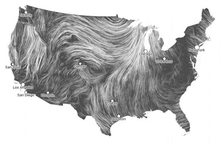
Take a look at these Wind Maps created by Fernanda Viégas and Martin Wattenberg over at Hint.fm. They are stunning and accomplish digitally what we try so hard to do in the architectural field, which is to clarify data to the point where it is both useful and enjoyable. The concept can be applied to weather data, as done here, or to any other field that asks users (read 'occupants') to process and interact with information. Whether we focus on 'advertising' or 'building wayfinding' this priciple has been central to good design from the very beginning.
Here is how the creators describe their Wind Maps: "Surface wind data comes from the National Digital Forecast Database. These are near-term forecasts, revised once per hour. So what you're seeing is a living portrait. (See the NDFD site for precise details; our timestamp shows time of download.) And for those of you chasing top wind speed, note that maximum speed may occur over lakes or just offshore."
Thanks to Fernanda Viegas and Martin Wattenberg for their work making the world a little easier to comprehend.
For more beautiful visualizations visit Hint.fm.
Recent Posts
Reimagining Harborplace to Create Space for Both Private Development and Expanded Public Space » Lawyer's Mall Reconstruction Progress » Confronting the Conventions of Customary Practice » Reconceived Facades: New Roles for Old Buildings » Ivy Bookshop Opens for Business! »
Categories
Yellow Balloon Baltimore » Products + Technology » Industry + Practice » Other » Architecture »
Links
Organizations
- USGBC Baltimore Regional Chapter »
- AIA - American Institute of Architects »
- USGBC »
- The Walters Art Museum »
- Green-e »
- Center for Building Performance and Diagnostics (CMU) »
- Green Globes »
- Prefab Lab (UT) »
- Center for Sustainable Development (UT) »
- Architecture 2030 »
- Bioneers »
- Street Films »
- FreeCycle »
- Chesapeake Bay Foundation »
- Archinect »
- BD Online - The Architects Website »
- National Wildlife Foundation »
- Natural Resources Defense Council »
- Overbrook Foundation »
- Merck Family Foundation »
- Ecology Center »
- New Building Institute »
- Neighborhood Design Center »
- The Leonardo Academy »
- ZigerSnead Architects LLP »
- The Rocky Mountain Institute »
- Urban Habitats »
- ACORE - American Council on Renewable Energy »
- Parks and People Foundation of Baltimore »
- Open Society Institute of Baltimore »
- Natural Capital Institute »
- Passive House US »
- Svanen Miljomark »
- Green Restaurant Association »
- Rocky Mountain Institute »
- Green Exhibits »
- Green Roundtable »
- John Elkington - SustainAbility »
- SustainAbility »
- Building America »
- Endangered Species Program - Fish and Wildlife Service »
- Congress for the New Urbanism »
- Urban Land Institute »
- Cool Roof Rating Council »
- Montgomery County (MD) Public Schools Green Building Program »
- National Institute of Standards and Technology Software »
- Scientific Certification Systems »
- Community Greens »
- CBECS »
- CASE - Center for Architecture Science and Ecology »
Interesting Sites
- The Ecologist »
- Treehugger »
- Grist »
- WIRED »
- Planet Architecture »
- MiljoBloggAktuellt - Environmental News Blog (Swedish »
- Sustainable Design Update »
- Eikongraphia »
- World Architecture News »
- The Cool Hunter »
- Design Center »
- ZEDfactory »
- Architen Landrell Associates Ltd. »
- Environmental Graffiti »
- businessGreen »
- Best Green Blogs Directory »
- Groovy Green »
- EcoGeek »
- Urban Ecology »
- Locus Architecture »
- Urbanite »
- A Daily Dose of Architecture »
- Adaptive Reuse »
- Audacious Ideas »
- Big Green Me »
- NOTCOT »
- Sustainable Baltimore »
- Thoughts on Global Warming »
- Green Maven »
- WorldChanging »
- Go For Change »
- Building Green »
- Home Energy Magazine »
- Home Energy Blog »
- FEMA Map Service- Federal Emergency Management Association »
- Architectural Graphic Standards »
- E-Wire »
- Post Carbon Cities »
- Alt Dot Energy »
- Whole Building Design Guide »
- B'more Green »
- EJP: Environmental Justice Partnership »
- Baltidome »
- OneOffMag »
